Make Carbon Visible
A public data campaign and a companion tracker for Middlesbrough, built on the town’s own estimated CO₂ figures. One system, two scales: the number a town shares, and the number a person owns.

01 — About
It’s one of my Master’s projects. The brief imagines Middlesbrough as a working example of post-carbon urban living, not a perfect one, but a visible one. Energy use, water cycles and resource flows are made public through the built environment, and carbon budgets are displayed the way timetables once were. The town is admired less for beauty and more for honesty.
Visual communication plays a central role in making invisible systems understandable to residents and visitors. Buildings, transport hubs and public spaces use clear, non-heroic graphics to explain trade-offs, limits and consequences.
The Post-Carbon Demonstrator · project brief
02 — Goal and approach
Make an invisible number something you can stand in front of
The city scale
Campaign screens placed where people already wait like transport hubs, civic buildings, public squares. They carry the town’s emissions as a running public record: what it was, what it is, which sector is moving and which is not.
The personal scale
A tracker app that converts an ordinary day like a car journey, a meal, a kilowatt hour into the same unit and the same colours used on the screens outside, so the two readings are recognisably the same measurement.
Why both
The screens alone give a fact with no handle on it: the number is true and there is nothing to do about it. The app alone gives a private score with no context: 5 kg means nothing until you know the town averages. Together the two readings explain each other, which is the whole mechanism, a shared fact you cannot avoid, and a personal one you can move.
03 — Data research
Six years, five sectors
Estimated CO₂ for Middlesbrough across 2005, 2008, 2012, 2014, 2016 and 2017.
2005
Total ~305–340 kt
Industry / Factories
110–130
35–38%
Transport
85–95
27–30%
Domestic (Homes)
65–75
20–22%
Commercial & Public
30–40
10–12%
Waste & Agriculture
8–12
3–4%
2008
Total ~285–307 kt
Industry
95–110
33–36%
Transport
80–88
28–30%
Domestic
60–68
21–23%
Commercial/Public
28–35
10–12%
Waste/Agriculture
7–10
3%
2012
Total ~272–289 kt
Industry
85–100
31–35%
Transport
78–85
29–31%
Domestic
58–65
21–23%
Commercial/Public
27–30
10–11%
Waste/Agriculture
6–9
3%
2014
Total ~222–288 kt
Industry
70–95
30–33%
Transport
75–82
28–32%
Domestic
50–60
22–25%
Commercial/Public
20–28
9–11%
Waste/Agriculture
5–8
3%
2016
Total ~209–289 kt
Industry
65–90
28–32%
Transport
70–80
30–34%
Domestic
48–55
22–26%
Commercial/Public
18–25
8–10%
Waste/Agriculture
5–7
3%
2017
Total ~197–289 kt
Industry
60–85
27–31%
Transport
68–78
32–35%
Domestic
45–53
23–26%
Commercial/Public
17–22
8–10%
Waste/Agriculture
4–6
2–3%
What the numbers actually say
-24.7%
Total, 2005 to 2017
322.5 kt down to 243 kt on published midpoints
-39.6%
Industry
The steepest fall of any sector
-18.9%
Transport
The shallowest fall of any sector
-30.0%
Domestic
Homes, roughly in line with the total
The finding the whole project rests on
By 2017 transport overtakes industry as Middlesbrough’s largest source of CO₂.
04 — Data visualisation
Turning a spreadsheet into something readable in four seconds
One colour, one sector
Each sector is assigned a colour once and never reassigned. On a city screen, in a table, in a legend, blue is always industry and purple is always transport. Colour carries meaning so the label does not have to be read twice.
Stacked, not separated
Stacked bars keep the total and the composition in one shape. A reader who only glances gets the direction of travel; a reader who stops gets which sector moved.
Ranges stay visible
The source data is uncertain, so the uncertainty is printed. Charts use midpoints and say so. Honesty was the brief’s word, and hiding a range would fail it.


05 — The campaign in the city
Carbon budgets displayed the way timetables once were
Digital screens sited where people already stand still like transport interchanges, civic buildings, public squares. Each screen carries one reading and one comparison, never a whole dashboard. The unit of attention is a person waiting for a bus, not a person studying a report.
Screen design
Three placements to be photographed and dropped in below.
Photo 1
Transport interchange
Drop the in-situ shot here
Photo 2
Civic building foyer
Drop the in-situ shot here
Photo 3
Public square
Drop the in-situ shot here
An awareness campaing
Grounded in startling data visualizing the escalation of global CO2 emissions to 40 billion tonnes across key sectors, this motion video confronts the urgent reality of our climate crisis and concludes with a powerful call to action, challenging viewers to embrace sustainable habits like reducing, repairing, and recycling to ensure a breathable future.
A motion video which will go the social medias for awareness campaign
06 — The tracker app
The same measurement, at the size of one day
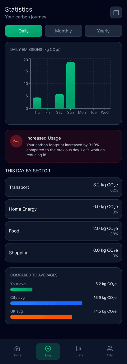
The screens outside give a number for the town. The app gives the same number for a person, in the same unit, so the two can be held against each other. A day is logged in four taps, converted with published emission factors, and set against the city and national averages.
Log in four taps
Category, activity, amount, done. Anything longer and the log stops happening after week one.
Factors, not guesses
Each activity carries its published factor, 0.17 kg per km driven, 4.5 kg for a beef meal, shown on the row so the arithmetic is never hidden.
Always compared
A figure alone is meaningless. Every view puts your number beside the city average and the UK average.
Rolls up to the city
Individual logs aggregate into the same city total the public screens display, closing the loop between the two scales.
Key screens




07 — Why making it visible changes anything
A number you can see is a number you can argue with
The mechanism this project is betting on is not guilt. It is feedback. Carbon is invisible, delayed and collective, which is close to a worst case for changing behaviour. The design job is to give the quantity the three properties it is missing.
Immediate
A journey logged at 14:00 shows up in today’s total at 14:01. The gap between the act and the consequence is where most carbon decisions get lost, so the app closes it to nothing.
Comparable
5.2 kg is neither good nor bad on its own. Beside a city average of 16.9 kg it becomes a position, and a position is something a person can defend or change.
Shared
The screens put the same figure in front of everyone at once. A private number changes one household; a public one changes what a town considers normal, which is the larger lever.