CASS
A design research project about ownership. CASS is a modernized cassette player using swappable music cards as a contemporary ownership object for a generation raised on rented culture.

Field
Branding · 3D · Campaign
Date
2026
Role
Art / Creative Director
Tools
Blender · Figma · PS
01 — Overview
Rewind what’s yours.
CASS is a modernized cassette player using swappable music cards as a physical, ownership-first alternative to streaming. One card. One album. Forever. Directed and produced as art/creative director across every discipline: strategy, brand identity, industrial design, 3D modelling, campaign and event over twelve weeks.
02 — The Problem
Why I made it
Ownership is disappearing from digital life. Music is the clearest example, albums removed from platforms without warning, subscription costs rising annually, libraries that vanish when access ends.
The market offers either infinite access with no ownership, or nostalgic replicas built for people who remember. Nothing serves a young audience that wants to own music but has never had a format designed for them. That is the gap CASS answers.
CASS is not a retro revival, it is a contemporary ownership object, drawing from the past without pretending to restore it. The challenge was making something feel familiar and new at exactly the same time.
617M
Spotify users
87%
Gen Z streaming fatigue
200%
cassette sales growth
$1BN
vinyl revenue
03 — Positioning & Audience
CASS is positioned as a contemporary ownership object, not a nostalgia product.
It speaks with five characteristics under the motto rewind what’s yours, which carries both the physical act of winding tape and the cultural act of reclaiming what you paid for.
Confident
Warm
Considered
Honest
Timeless
The audience is Gen Z and younger Millennial listeners, roughly eighteen to thirty-five, culturally fluent in physical formats without having lived through them.
Motto
Rewind what’s yours.
04 — Identity System
Constructing the mark
The CASS brand mark is built from one idea: the inner mechanics of a cassette tape, abstracted into a contemporary symbol. Every element of the system carries the same argument.

The symbol
Five rounded rectangles arranged in a circular formation: each one representing an inner roller of a cassette tape. The rollers are the hidden mechanical heart of the cassette: the parts that grip the tape and keep the music moving.
The idea
By abstracting the rollers into a mark, the CASS symbol carries the cassette’s inner workings as its identity simultaneously reading as card, reel and loading state. One shape, three meanings.
Logo variations

Primary logo
Symbol + wordmark

Secondary logo
Stacked arrangement

Symbol only
Minimum viable mark

Wordmark only
Text-first contexts
05 — Colour & Type
Colour
Black
#0A0A0B
Primary background
White
#FFFFFF
Primary foreground
Accent
#DB5203
Brand accent
Monochrome with one orange accent. Type carries the emotion, colour is used sparingly, for emphasis and recognition.
Typeface
LED Dot-Matrix
Primary typeface · display, wordmark, UI labels
The typographic language of Casio watches, arcade scoreboards and early digital displays. As Barthes notes, typefaces carry cultural memory in their letterforms before a word is even read.
Helvetica
Secondary typeface · body, headings, editorial copy
A neutral workhorse that lets the dot-matrix display carry the character without competing with it.
06 — Product Research
Products research & lessons
Each measured on form fidelity, interaction honesty, material quality and cultural position. The common thread: the ones that work translate rather than replicate.
Product
Lesson
Retrospekt Player
Pure replication only reaches people who remember
Polaroid Now
The ritual is the product
Teenage Engineering
Tactile density can be the brand
Light Phone
Restriction is a selling point
Nokia 3210
Familiar form + modern port = trust
Tivoli Model One
Material makes minimalism read as considered
Why a card, not a tape
Tape carries the right meaning but degrades. The PS2 memory card has the same grammar hold, orient, insert, commit without the fragility. It gave me a form language that felt earned rather than borrowed.
The insertion ritual
The friction is the point. Choosing one album, physically picking up a card and committing it to the slot, is the action that streaming removed. That one gesture is the entire product argument made physical.
07 — From Precedent to Position
Eight products studied. Each one surfaced a gap. CASS was designed from those gaps, not from a visual reference.
Gap
Precedent
Problem
CASS
Visual nostalgia only
Replicated original aesthetics
Ceiling: people who already remember
Cassette as reference, not template
No ownership argument
Sold on feel
Aesthetics without purpose
Card format makes ownership physical
Degrading media
Kept tape format
The object destroys itself
Solid-state card, same grammar, no fragility
Access remained infinite
Added streaming alongside physical
Hybrid dilutes the argument
Card only. The constraint is the feature.
No new audience
Designed for people who remember
Market ceiling is 45+
Built for people who grew up on Spotify
08 — Sketch to Render
Two objects, same pipeline
The player and the card were developed in parallel — each stage answered a different question: proportion first, then interaction, then material credibility. Nothing moved forward until the previous stage was committed.
CASS Player · 100 × 64 × 12mm reference footprint

01 · Sketch
Initial ideation form, proportion, port placement. Drawn against the real 100 × 64mm cassette footprint to keep scale honest from day one.

02 · Wireframe
Hi-fi wireframe drawn from sketch to a near-realistic view used as the reference to build the 3D model in Blender.

03 · Topology
Wireframe overlay check with edge flow, pole placement, quad density. Correct topology before any subdivision or surface detail is locked in.

04 · Render
Final lighting and material pass. Matte polymer body, brushed aluminium detail and glass display, lit to read as a photograph rather than a render.
The music card


09 — Campaign
Five posters. One question.
The campaign runs before the product is shown. Five posters, placed across the city in spaces that belong to the target audience with each one building a case. The product does not appear until the last frame. Every poster was built by hand in Photoshop, with analogue imperfection as a design choice rather than a limitation.

01 · Context
The Arc of Listening
Opens the campaign without mentioning CASS. A pure historical record: cassette, CD, iPod, streaming. Each format owned. Each format replaced. The poster asks nothing. It maps the arc and leaves the gap at the end visible. The fingerprint texture in the corner is intentional — a trace of someone who touched this era of music and moved on.
Why this works
The audience needed to feel the pattern before they felt the problem.

02 · The Question
So, What About Now?
The timeline from poster one reappears at the bottom with dates ending in 2008. ‘Every generation had their format. Every generation owned their music.’ Then: ‘So, what about now?’ No product. No answer. Just the gap.
Why this works
The question was always the campaign. This poster makes the audience feel the absence before they know what fills it.

03 · The Problem
You Don’t Own This
A smartphone wrapped in chains. Two padlocks: one stamped ‘£9.99/month’, one stamped ‘forever’. The streaming interface is visible through the screens. ‘They gave you a key to the house you don’t own.’ The tone shifts: this is not nostalgia, it is critique.
Why this works
Anti-streaming is still a product — stay honest, not sentimental. This poster earns the right to be honest by naming the system, not the user.

04 · The Crisis
Subscription Expired
Red smoke erupting from a phone. Album covers scattered mid-air. ‘Subscription expired.’ Then, in the clearest language of the campaign: ‘10 years of playlists vanished overnight.’ The image makes the abstract fact visceral.
Why this works
The image communicates loss in under a second. Colour arrives here for the first time and the red is the only accent in the whole campaign.

05 · The Answer
Rewind with a Pen
Black background. A pen rewinding exposed tape — the image every cassette owner knows. ‘You knew what you owned.’ Then: ‘Rewind your relationship with music like you used to rewind with a pen.’
Why this works
The campaign’s emotional resolution. Four posters built the case; this one closes it, making the product argument physical before the product is shown.
10 — City Presence
Everywhere they already are
Posters placed in spaces the target audience passes through. Record shops, universities, music venues and the streets between. The campaign builds context before the product arrives.


11 — Launch Registration Site
The campaign resolves here
The campaign closes with a countdown. The registration site is where the question from the posters “what about now?” gets an answer: you’re on the list. Two screens, one emotional movement: anticipation into belonging.
Screen 01 · Countdown

LED Dot-Matrix countdown in orange-on-black. The timer makes waiting physical and the anticipation of the launch is the launch experience beginning.
Screen 02 · Registration

Three fields, one button: GET ON THE GUEST LIST. The simplicity mirrors the product argument that is limited, intentional, yours if you commit.
12 — The Launch Event
The moment the product finally exists
A keynote for registrants, a showcase booth and a store where the story becomes a purchase. Five posters of absence end here. The audience enters into the campaign language they already know and encounters the product for the first time. The event does not explain — it resolves.
Own the music. Own the moment.


13 — The Product Website
From event to ownership
The product website is where the event resolves into a transaction — the place a visitor reads the specifications and places an order.
Product landing page and scroll to specifications
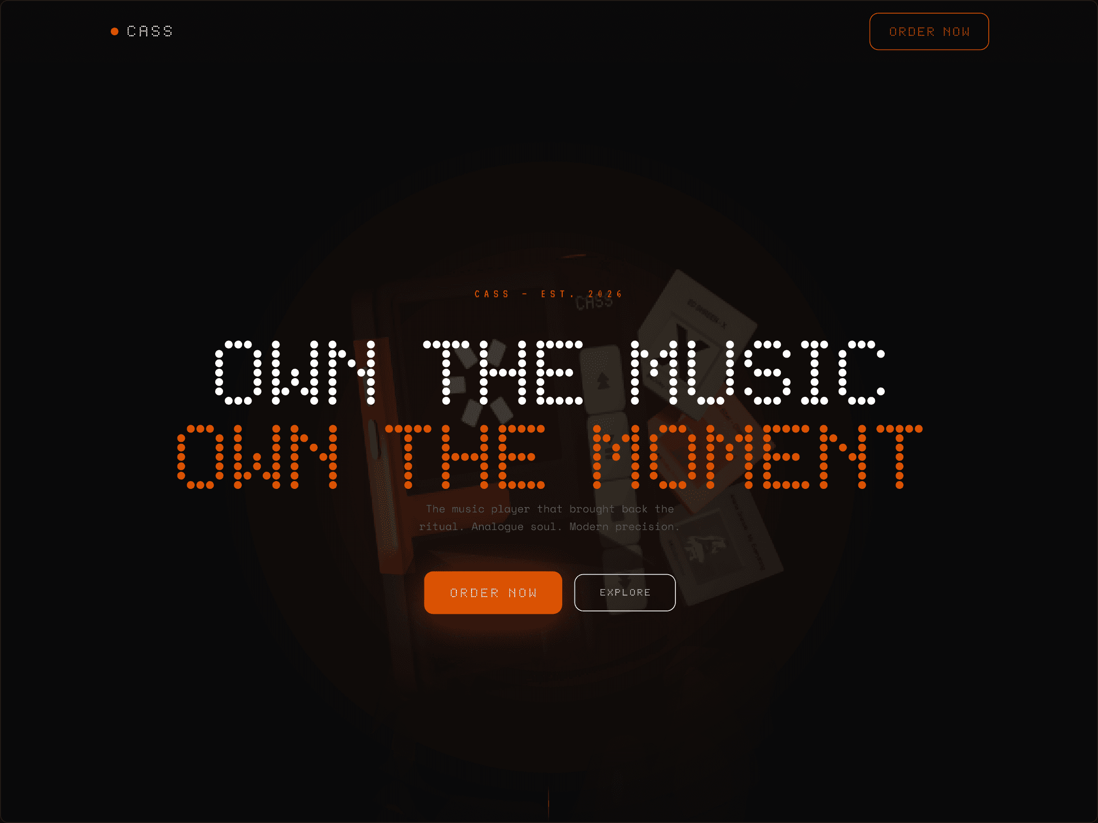
Own the music, own the moment — hero viewport
The product site opens with the same visual language as the event. Hero copy runs full-bleed. Stat counters establish credibility. Sections guide from desire → specification → order CTA. The brand never breaks.
Order flow — 3 steps to ownership

Step 01 · Shipping details

Step 02 · Payment

Step 03 · Order confirmed
The campaign asked a question for months. The event is where it gets answered.
CASS — EST. 2026