
Role
UI/UX Designer
Tools
Figma
01 — Context
Structured online learning, taught in Burmese
Toe Tet gives Myanmar learners courses taught in their own language, with examples drawn from their own market. Five categories span entrepreneurship and business, professional development, personal development, languages and diploma programmes, taught by named local instructors.
Surface 01
User app
iOS and Android. Browse, buy, watch and track progress on the move.
Surface 02
User web
The full catalogue, lesson player and learner dashboard in the browser.
Surface 03
Expert web
Where instructors build courses, bundle them and cash out earned points.
Surface 04
Admin console
Where operations approve experts, manage the catalogue and clear payments.
02 — Audience
Who the platform has to serve
Three groups use Toe Tet, and only one of them is a customer. Every decision had to be checked from three directions, what the learner sees, what the expert has to do to make it appear, and what operations has to verify before money moves.
Audience 01
Learners
Myanmar adults studying around a job, mostly on Android, mostly on mobile data. They want to know cost, length and language before committing.
Audience 02
Experts
Local instructors who teach for a living. They need to publish a course without a producer, and to see what they have earned.
Audience 03
Operations
The small internal team that approves experts, keeps the catalogue clean and clears every manual payment by hand.
03 — Goals
What success had to look like
Business goals
Grow supply — make publishing a course something an expert can finish alone.
Cut the manual work in payments and approvals as the catalogue grows.
Convert free learners to paid without ambushing them at a paywall.
Learner goals
Know the cost, the length and the language before committing.
Pick up where they left off, on any device.
Pay and get a clear confirmation that says what happens next.
04 — Research
How I started
I started on the supply side, because nothing a learner sees exists until an expert can publish it. Three methods, run in that order.
Method 01
Member interviews
Current members, thirty minutes each, conducted in Burmese. Focus: how a session starts, and what makes them abandon it.
Method 02
Heuristic audit
A full walkthrough of the live product against Nielsen’s heuristics, scored per screen. Visibility of system status scored worst.
Method 03
Competitive review
Regional and global learning platforms, examined for how each signals price, length and access state on a card.
05 — Research
Method
Member interviews
Current members, thirty minutes each, conducted in Burmese. Focus: how a session starts, and what makes them abandon it.
Competitive review
Blinkist, Storytel and two regional platforms, examined for how each signals length, format and paywall state on a card.
06 — Design thinking
How the work actually ran
Five stages, but not a straight line — the expert flow sent me back to research twice.
Stage 01
Empathise
Interviews with learners and experts, plus a heuristic pass over the live product.
Stage 02
Define
Three audiences, one catalogue, one ledger, written down as constraints before any layout.
Stage 03
Ideate
Wireframes and three navigation directions, judged against intent-driven use rather than browsing.
Stage 04
Prototype
Clickable flows for the two paths that carry money: learner checkout and expert cash-out.
Stage 05
Test
Walkthroughs with learners and experts. The cash-out flow was rebuilt after the first round.
07 — Information architecture
Restructuring the shelf
Navigation collapsed to four destinations. Format became a filter inside the library rather than a branch of the tree which is what let one page serve every content type.
Home
Library
Category
Pricing
Account
The flow I spent the most time on
Checkout. The bank transfer couldn’t be removed, so I broke it into three acknowledged steps with a clear end state.
Choose plan
Bank details shown
Transfer outside the app
Upload slip
Confirmation
Email receipt
Change 01
Bank details before you leave
Account number, name and a support line with office hours, all on screen before the member switches to their banking app.
Change 02
The slip is the receipt
Uploading the transfer screenshot became the explicit final action, so the member ends on a deliberate step rather than a guess.
Change 03
A real confirmation
A success state that says what happens next and when, not just a thank you.
08 — Information architecture
Four front doors, one spine
Every surface reads and writes the same three things. Keeping that spine single is what lets an expert’s earnings, a learner’s purchase and an admin’s approval describe one transaction rather than three.
Shared 01
One account
A person signs in once. Their role decides which surface opens, not which login they use.
Shared 02
One catalogue
Courses, lessons and bundles are one tree. Category and format are filters on it, not branches of it — which is what lets one page serve every content type.
Shared 03
One points ledger
Purchases, expert earnings, transfers and cash-outs are entries in the same ledger. That single record is what makes admin reconciliation possible at all.
09 — Design system
The system underneath
Burmese script is the reason the system takes the shape it does. It stacks diacritics above and below the baseline, offers no italic, and has a narrow range of usable weights — so hierarchy has to come from size, colour and space rather than style.
Foundation 01
Type
Padauk for Burmese with line-height raised to clear stacked marks. Latin is the only script ever set in caps, and only for metadata.
Foundation 02
Colour
One accent carries access state. Every state also carries a label, so colour is never the only signal.
Foundation 03
Space
An 8px scale shared across all four surfaces, so a card built for the app measures the same in the admin console.
Foundation 04
Targets
A 44px minimum touch target, set by the app and inherited by the web surfaces rather than relaxed for them.
10 — User app
The learner’s app
Android-first and built for data-conscious use. Three screens carry the product: what you own, what you can find, and what you are watching.

My Courses — enrolled courses with progress, runtime and lesson count on every card.

Explore — search, bundles and category tiles in one shell, with format as a filter.

Lesson player — video over the lesson list, tabbed with overview, resources and community.
11 — User web
The learner’s web platform
Same account, same catalogue, more room. The web surface is where longer browsing and comparison happen, and where new visitors land from search.

Home — the signed-in landing page, leading with continue-learning above curated shelves.

Explore — search, filters and category tiles against the full catalogue.
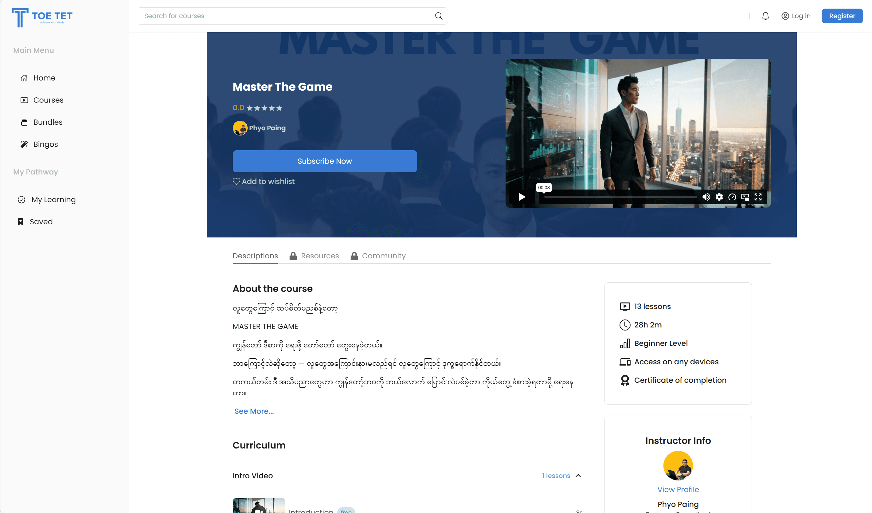
The learner dashboard — enrolments, wishlist and points balance in one place.
12 — Expert web
The expert’s studio
The supply side. An instructor has to be able to build a course, price it, publish it and get paid — without anyone from Toe Tet standing in the loop.
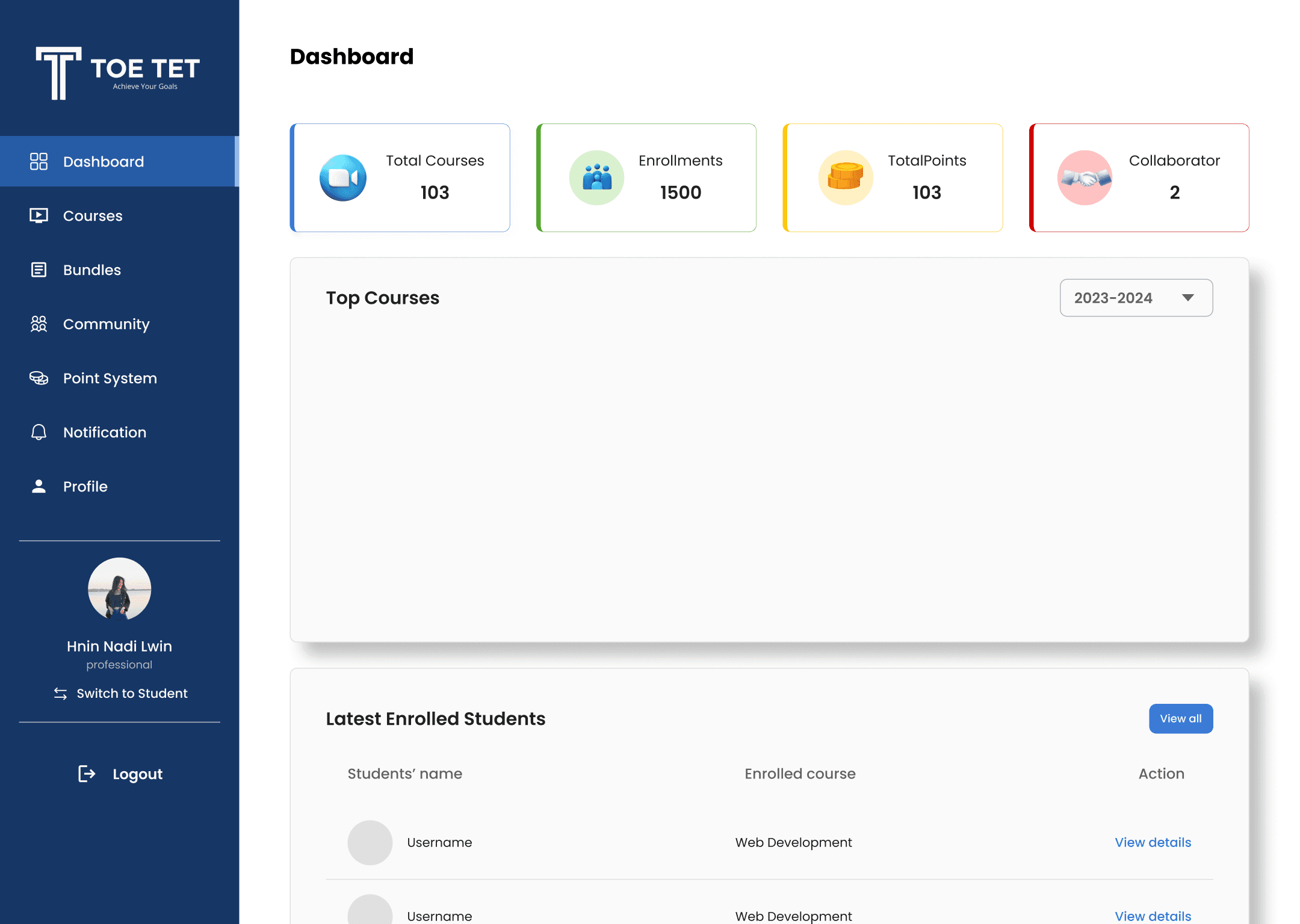
Dashboard — courses, students and points earned, on the screen that opens first.

Course creation, split into course, sections, lessons, resources and pricing so it can be finished in stages.

Cash-out — turning earned points into money, with the request state visible while it clears.
13 — Admin console
The operations console
Everything the other three surfaces assume somebody is doing: approving experts, keeping the catalogue clean, and clearing every manual payment by hand.

Dashboard — users, experts, courses and revenue reduced to one screen the team can scan.
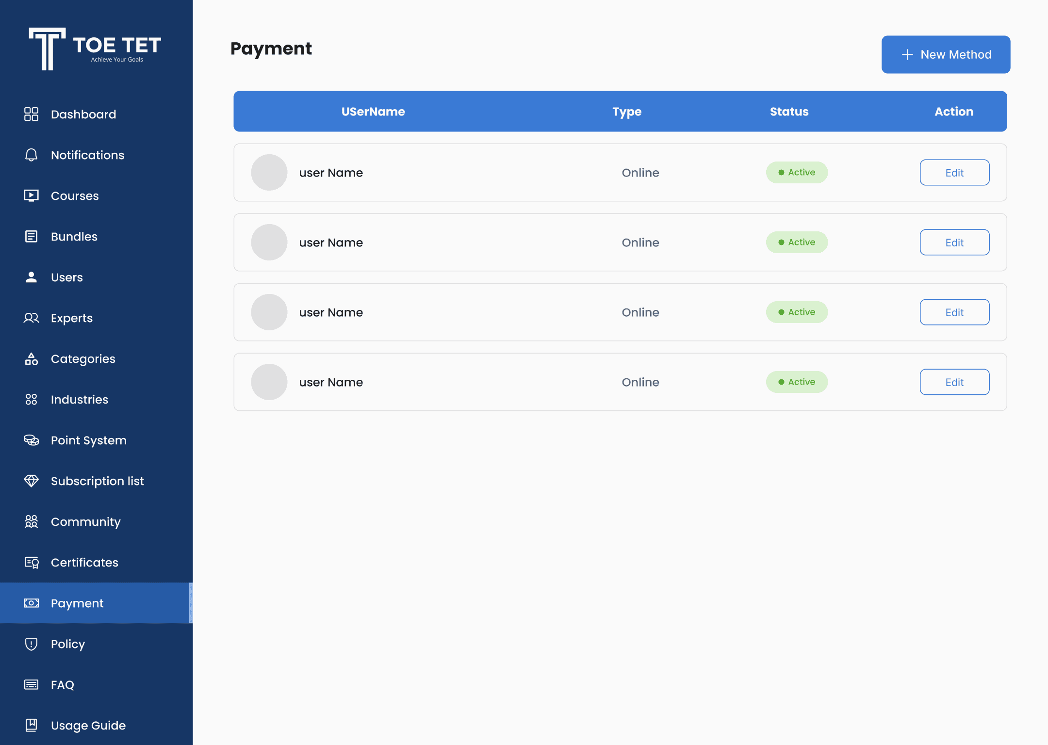
Payment management — every transaction, filterable, each carrying its own state.

Cash-out requests from experts, queued for approval with the evidence attached.

Live product
toetet.com · App Store · Google Play